Chapter 3 Using ggVennDiagram
Generate example data.
genes <- paste0("gene",1:1000)
set.seed(20210302)
gene_list <- list(A = sample(genes,100),
                  B = sample(genes,200),
                  C = sample(genes,300),
                  D = sample(genes,200))

library(ggVennDiagram)
3.1 long category names
If you use long category names in Venn plot, labels may be cropped by plot borders. To avoid this, just use a ggplot trick to expand x axis.
p1 <- ggVennDiagram(gene_list,
                    category.names = c("a very long name","short name","name","another name"))
p1
# expand axis to show long set labels
p1 + scale_x_continuous(expand = expansion(mult = .2))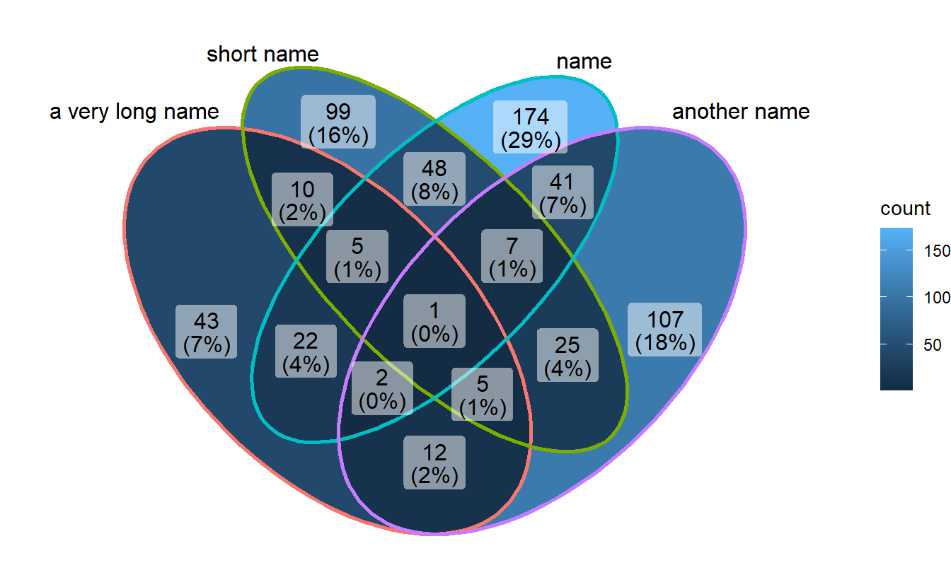
3.2 Show intersection values
When intersection values only have several members, ggVennDiagram is efficient to show the values in places.
set.seed(0)
small_list <- lapply(sample(6:10, size = 4), function(x){
sample(letters,x)
})
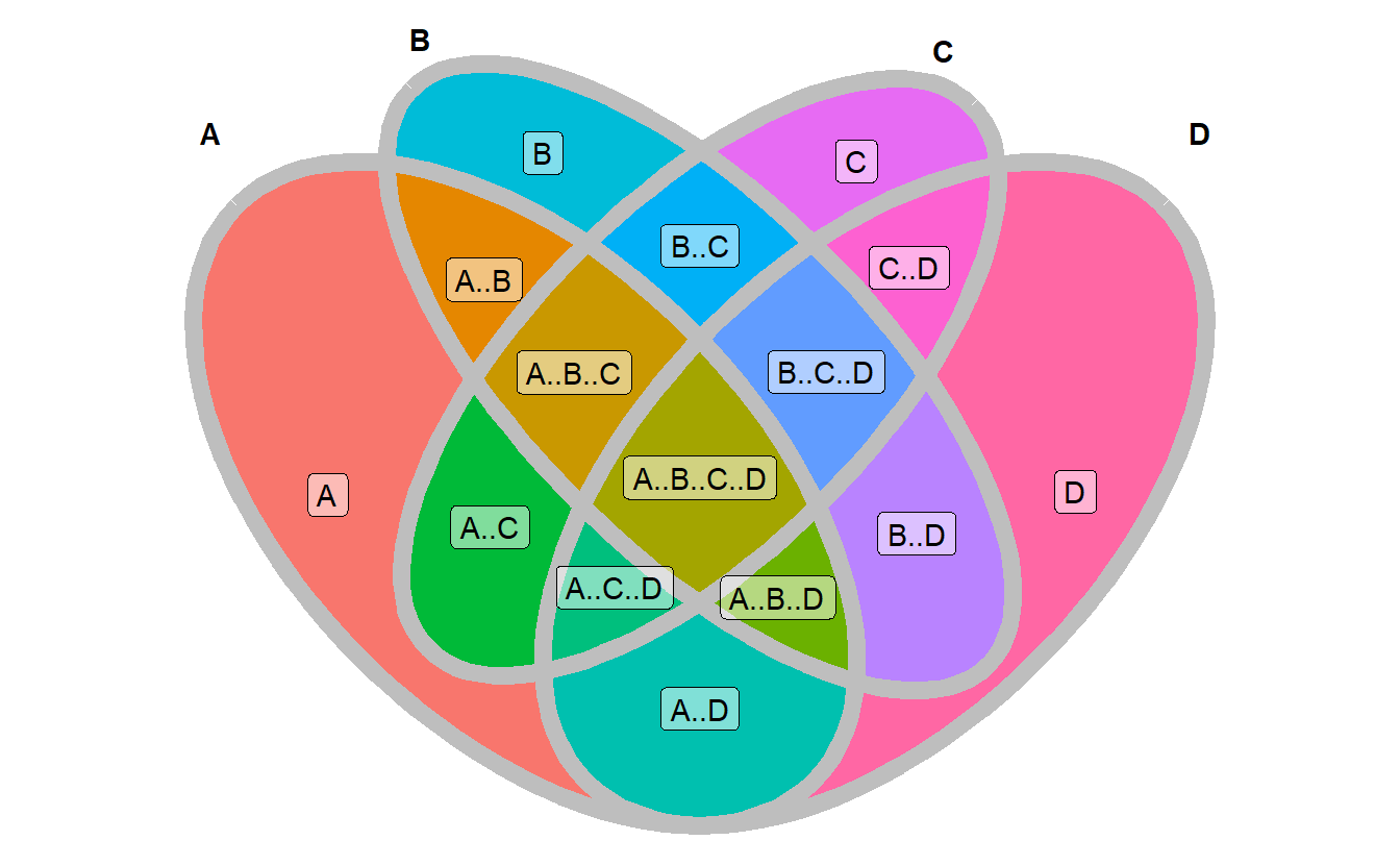
ggVennDiagram(small_list,
category.names = LETTERS[1:4],
show_intersect = TRUE)## Warning: Ignoring unknown aesthetics: text3.3 Setting set label
3.3.1 color of set label
ggVennDiagram(gene_list, set_color = c("blue","black","red","green"))
3.3.2 size of set labels
ggVennDiagram(gene_list, set_size = 8)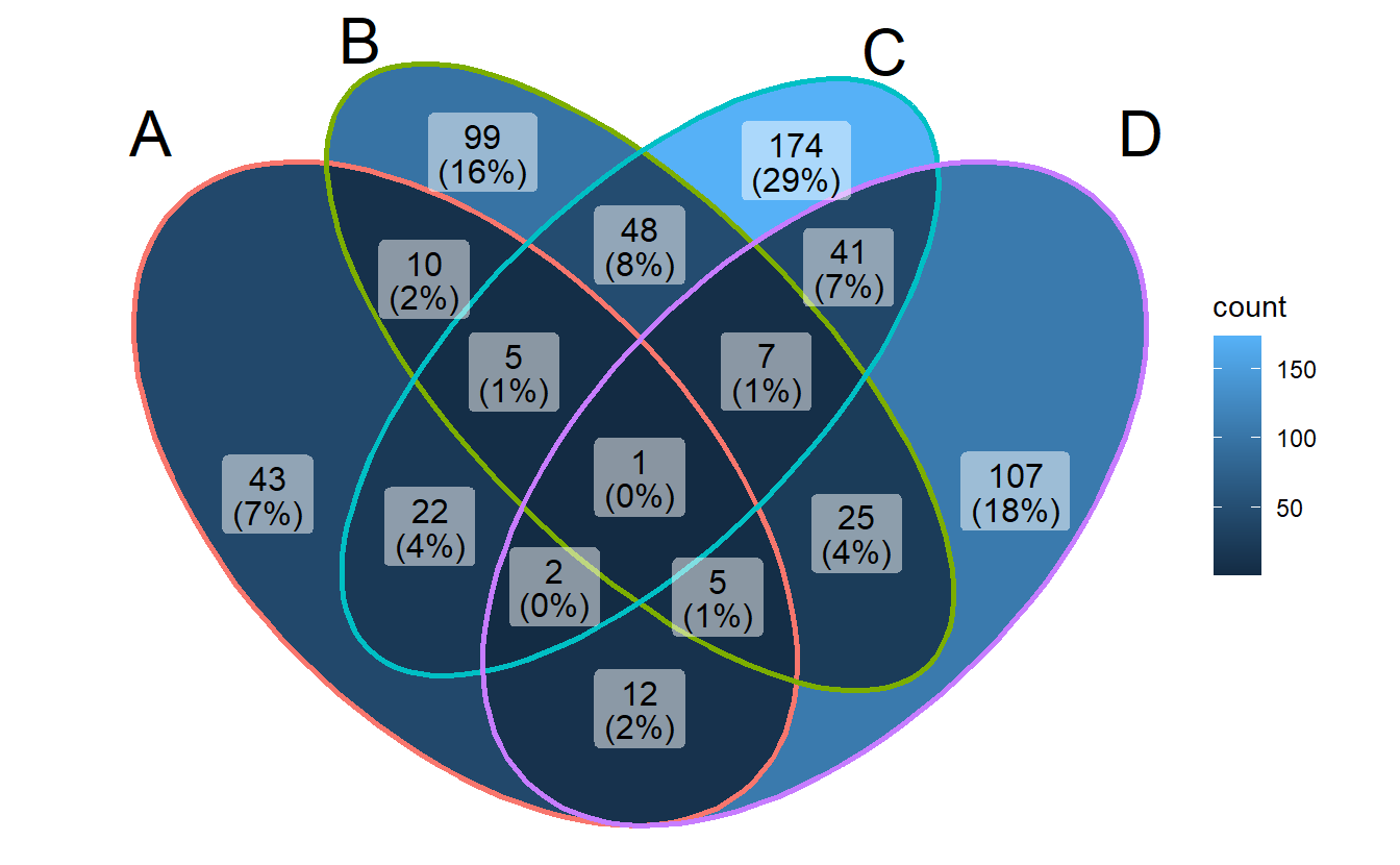
3.4 Setting region label
3.4.1 text content
ggVennDiagram(gene_list, label = "count")
ggVennDiagram(gene_list, label = "percent")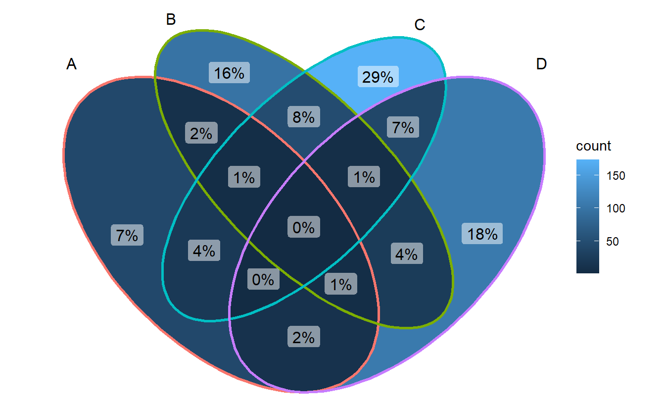
3.4.2 percentage digits
ggVennDiagram(gene_list, label_percent_digit = 1, label = "percent")
3.4.3 remove label background
- Method 1: set alpha to 0
ggVennDiagram(gene_list, label_alpha = 0)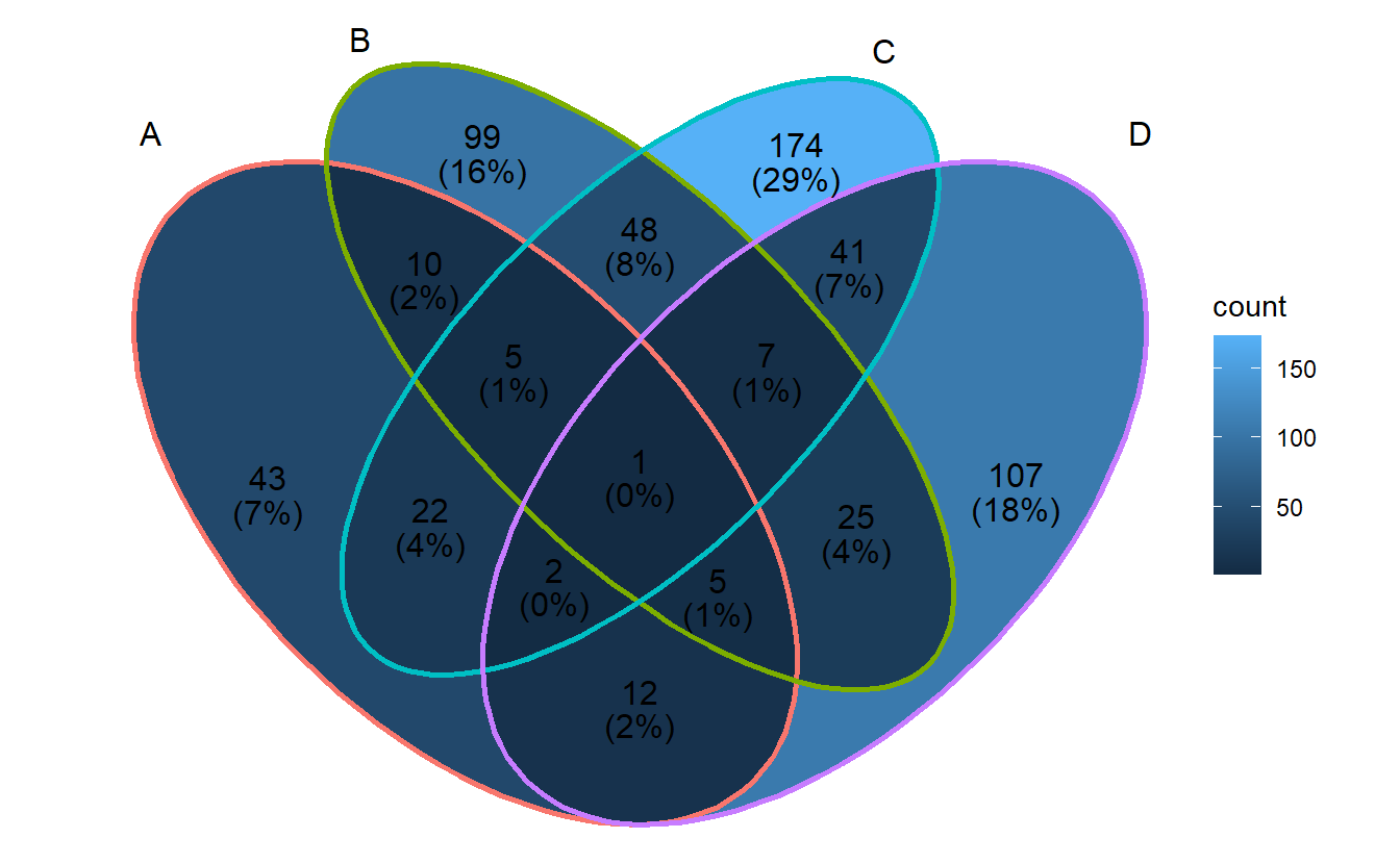 - Method 2: use
 geom_text()
ggVennDiagram(gene_list, label_geom = "text")
3.4.4 color and size
ggVennDiagram(gene_list, label_color = "firebrick", label_size = 4)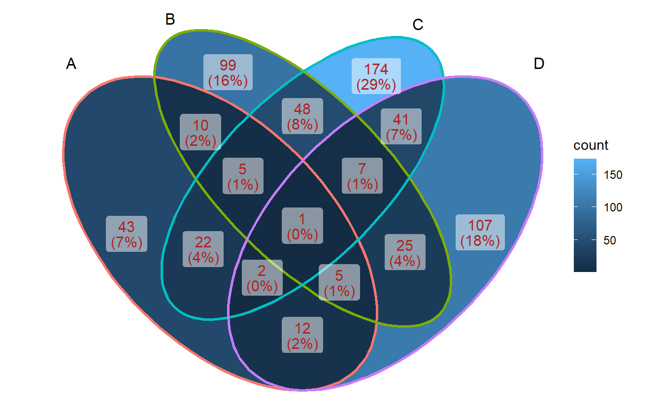
3.5 Setting set edges
ggVennDiagram(gene_list, edge_lty = "dashed", edge_size = 1)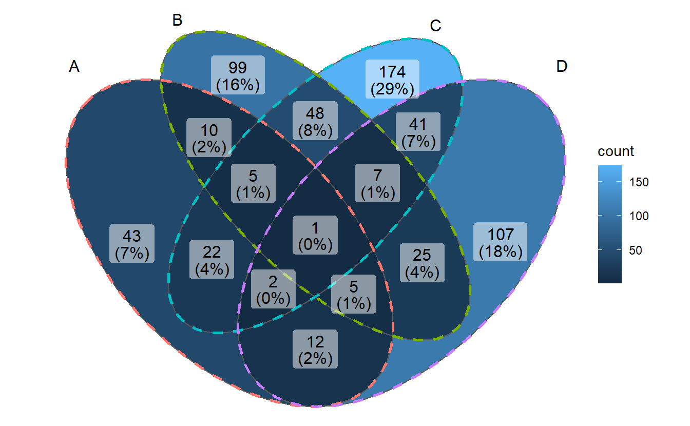
3.6 Changing palette
- changing fill palette
library(ggplot2)
p <- ggVennDiagram(gene_list)

# Red Blue
p + scale_fill_distiller(palette = "RdBu")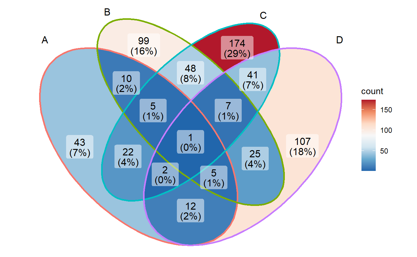
# Reds
p + scale_fill_distiller(palette = "Reds", direction = 1)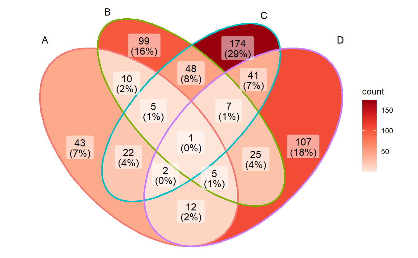
- change edge colors
p + scale_color_brewer(palette = "Set1")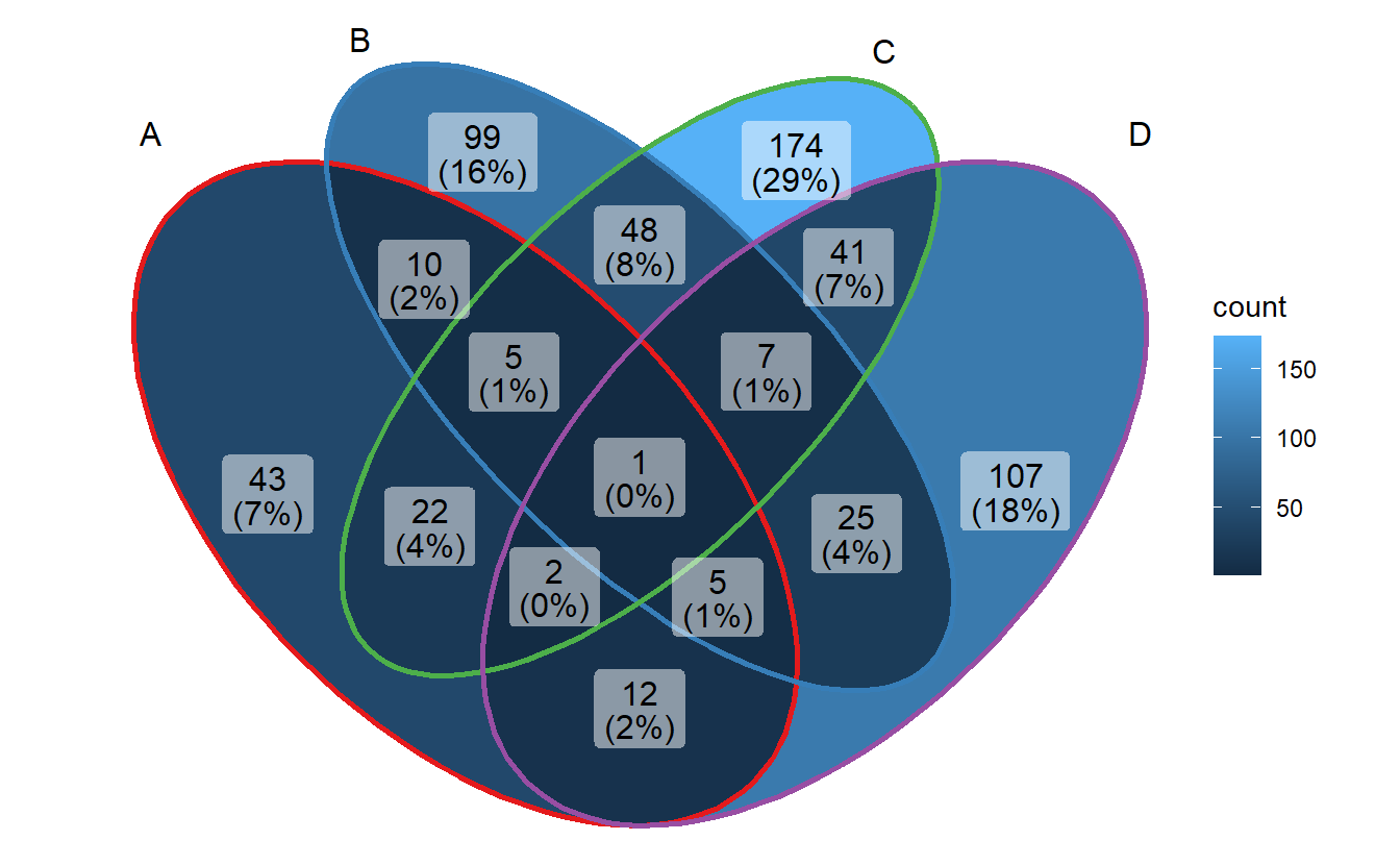
Some other palletes are:
RColorBrewer::display.brewer.all()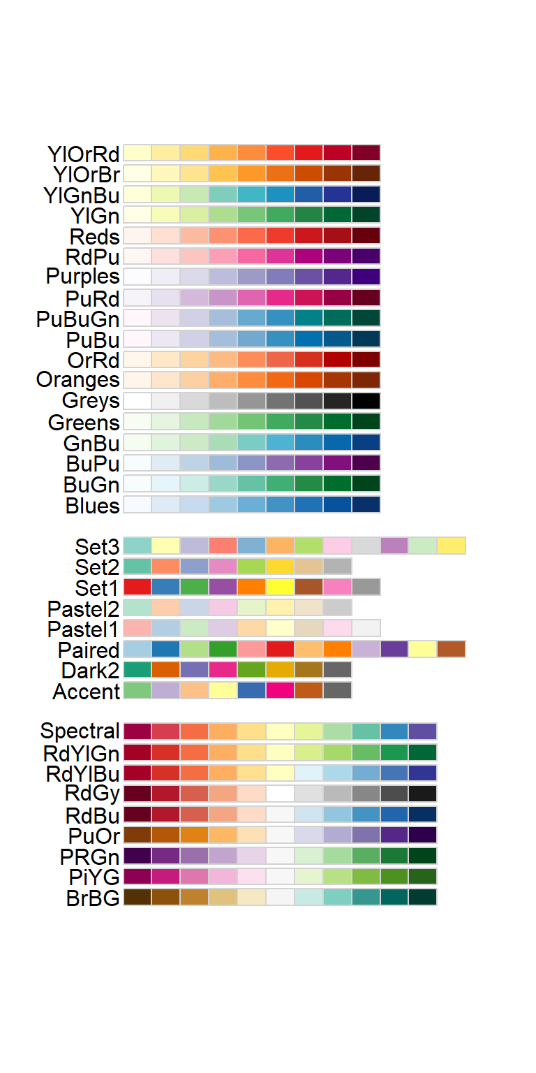
3.7 Adding note
p + labs(title = "Four sets Venn Diagram",
         subtitle = "generated by `ggVennDiagram`",
         caption = Sys.Date())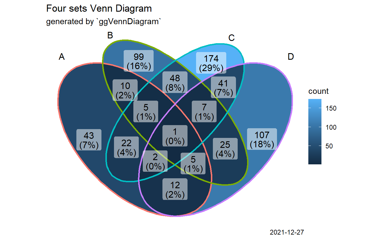
3.8 Comprehensive customization by using helper functions
The main function ggVennDiagram() accepts a list input, and output a ggplot object.
By measuring the length of input list, it automatically applies internal functions
to build a plot in two steps: data preparation and visualization.
Data preparation was packaged into one function process_data(). Its output
is a S4 VennPlotData class object, which contains three slots, setEdge,
setLabel and region. These slot data then can be further plotted with ggplot
functions.
See below for a better understanding.
venn <- Venn(gene_list)
data <- process_data(venn)
ggplot() +
  # 1. region count layer
  geom_sf(aes(fill = count), data = venn_region(data)) +
  # 2. set edge layer
  geom_sf(aes(color = id), data = venn_setedge(data), show.legend = FALSE) +
  # 3. set label layer
  geom_sf_text(aes(label = name), data = venn_setlabel(data)) +
  # 4. region label layer
  geom_sf_label(aes(label = count), data = venn_region(data)) +
  theme_void()
ggVennDiagram export functions to get these data, and they can be used
for comprehensive customization in user-side.
Venn(): Venn object constructor, use this to construct a Venn object from list.process_data(): process data with a Venn objectvenn_region(): get region data to plotvenn_setedge(): get setedge data to plotvenn_setlabel(): get setlabel data to plot
For example, you may change edge/fill/label properties as you will.
ggplot() +
  # change mapping of color filling
  geom_sf(aes(fill = id), data = venn_region(data), show.legend = FALSE) +
  # adjust edge size and color
  geom_sf(color="grey", size = 3, data = venn_setedge(data), show.legend = FALSE) +
  # show set label in bold
  geom_sf_text(aes(label = name), fontface = "bold", data = venn_setlabel(data)) +
  # add a alternative region name
  geom_sf_label(aes(label = name), data = venn_region(data), alpha = 0.5) +
  theme_void()